Children’s Books from the 1930s
/My parents were born in the early 1930s; that prompted a little project to browse books written for children during that decade when I found the Library of Congress contributions from the Albert Whitman & Co. in Chicago. 43 books are included as this week’s eBook(s) of the week. They are all available from Internet Archive.
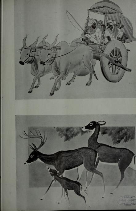
There are so many topics: make believe, holidays, history, other places and people, things to do, and pets. The illustrations reflect the perceptions of the world in the 1930s. Most authors are women and don’t have easy-to-find biographies.
It’s interesting to think about the children that read these books. I don’t think either of my parents did unless they saw them at school; they were rural/small town children during the Great Depression when the family finances were tight and buying books would not have been the priority. Perhaps some children in towns large enough to have libraries might have seen books there. Carnegie had built about half his libraries by the 1930s but the libraries were short of funds to continue operating during the Depression too. I’m left with the thought that only children of people that were well off (those fortunes were not impacted by the Depression) would have had these books at home.
1930
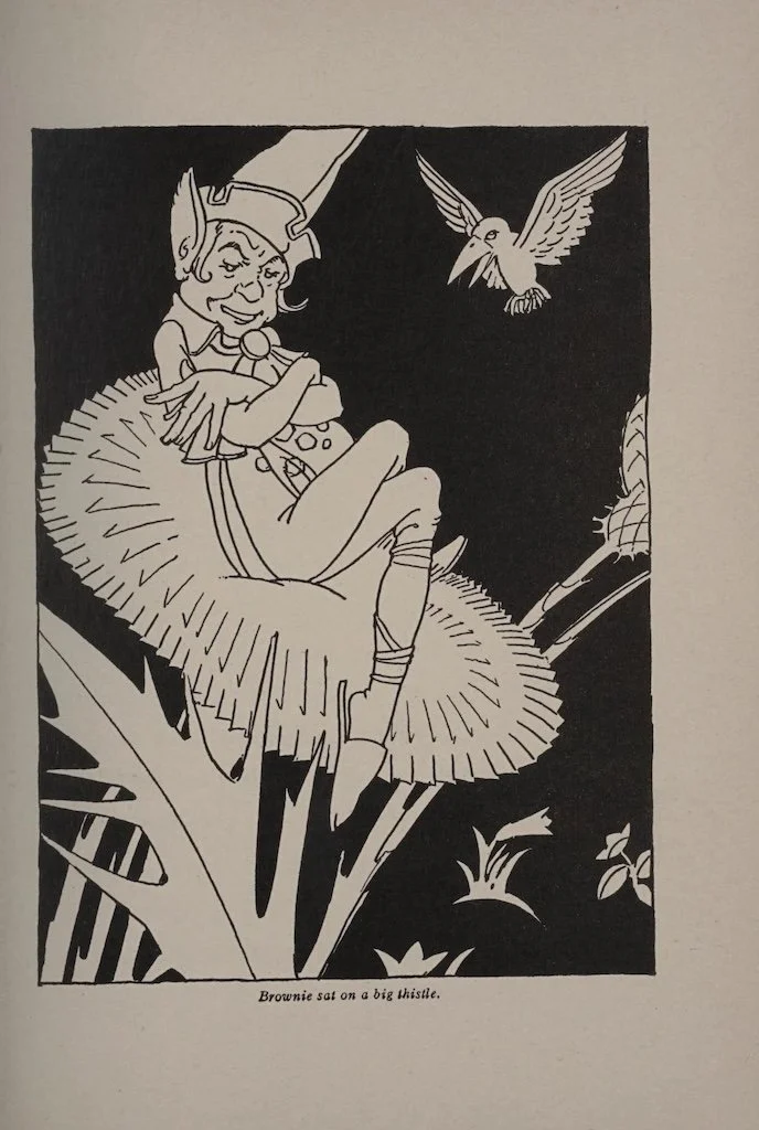
The adventures of a brownie - Craik, Dinah Maria Mulock; McCracken, James (illustrations)
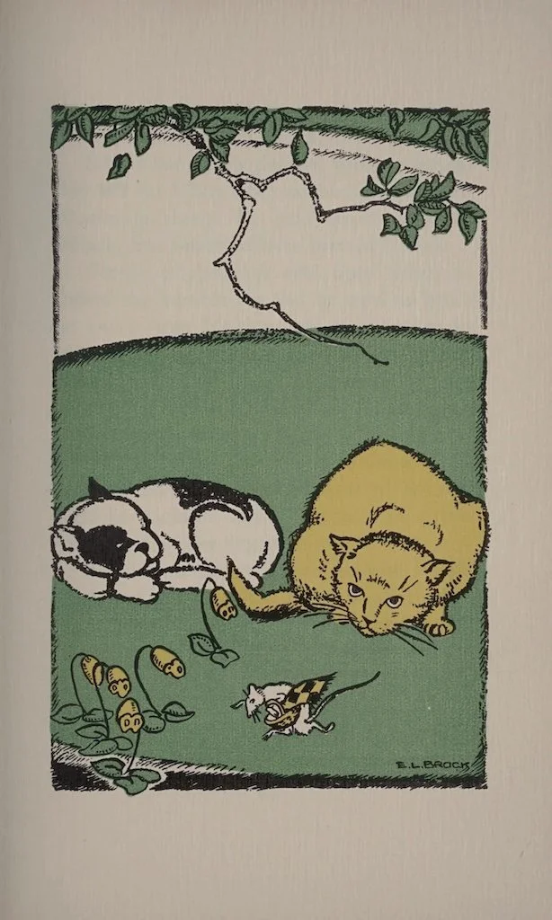
The nutcracker and the Mouse-king - Hoffmmann, Ernst Theodoor Amadeus; Brock, Emma L. (illustrator)
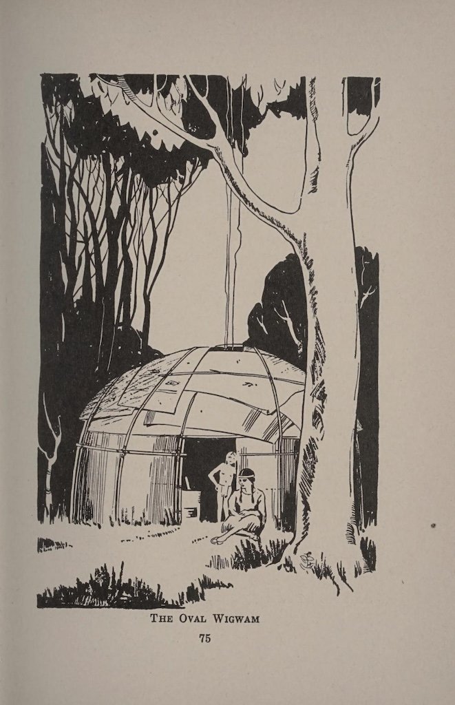
The unknown Indian - Browne, Gertrude Bell; Vernon, David Thomas (illustrator)
Harry's newspaper;or The young publisher - Cox, Stephen A. D.
Peter Piper's playmates - Hubbard, Eleanore Mineah


1931
Fluffy Cat's Tail - Sample, Ann Eliza
Moufflon, the dog of Florence - Ouida; Jenkins, Sara D. (retold by)
Wise Little Donkey - Segur, Sophie, comtesse de


1932
One little Indian boy - Brock, Emma L.
Around the world at play,a picture book of a German play fair - Ritter, Mathilde
Poogie and Sibella - Van Housen, Nita
Tallie, Tillie, and Tag: one little girl, one little doll, and one little dog - Kutzer, Ernst
The toy workshop in the land of silvery-blue - Ramsey, Tamara
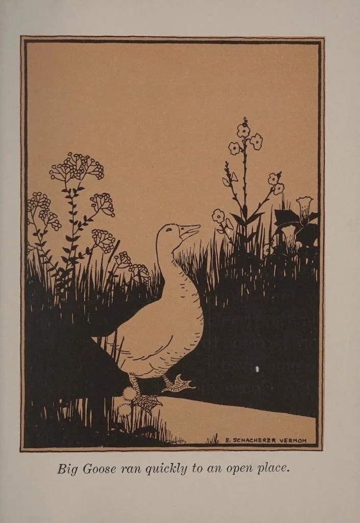
The big goose and the little hen - Woodruff, Jacob Lyon
Hansi the stork - Ludmann, Oscar


1933
Runzel-Punzel,a story of two little mice - Donaldson, Lois
The Candy Cottage - Furlong, May
The Lost Log Cabin - Furlong, May
The little gardeners - Morgenstern, Elizabeth
Smoky, the lively locomotive - Donaldson, Lois
Farm Folk - Brendel, C.A.


1934
Nimbo,the story of an African boy - Pease, Josephine Van Dolzen
Snowy for luck - Goode, Arthur Russell; Wiese, Kurt
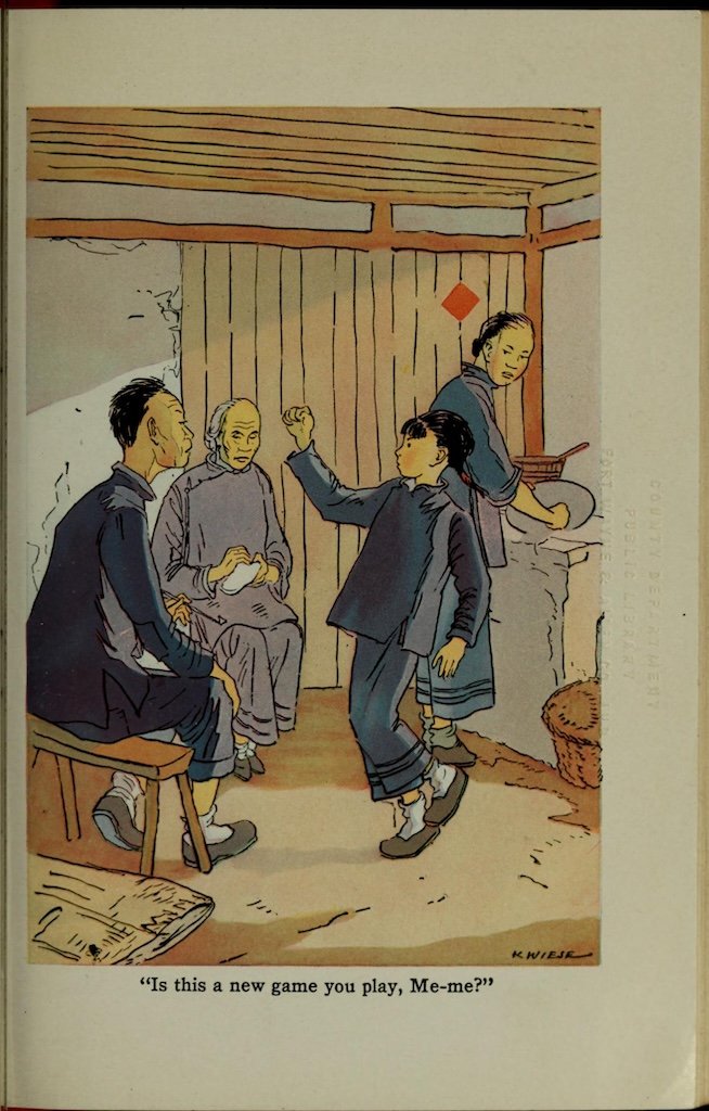
Ho-Ming : girl of new China - Lewis, Elizabeth Foreman


1935
Over the castle walls - Mabry, Caroline
Buffin - Barrett, Leone
Bing of the Diamond Tail - Gauss, Marianne


1936
The Traveling Gallery - Schiff, Besse; Brock, Emma
Sondo - a Liberian boy - Jospeph, Alfred Ward; Magnie, Bernice (illustrator)
Snipp, Snapp, Snurr and the yellow shed - Lindman, Maj
Snipp, Snapp, Snurr and the gingerbread - Lindman, Maj


1937
Firecracker - Gauss, Marianne
Hans Christian of Elsinore - Kristoffersen, Eva M.
Cheeky - a prairie dog - Lau, Jospehine Sanger; Wiese, Kurt (illustrator)
Silver Chief To the Rescue - O'Brien, Jack; Wiese, Kurt (illustrator)
A doll's family album - King, Edna Knowles


1938
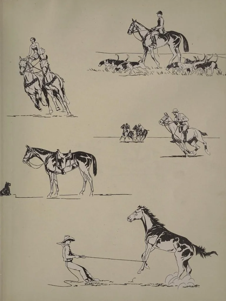
Hoofbeats, a picture book of horses - Cannon, James Leonard
Me and Andy, a boy and dog story - Kelly, Raymond Ramsome
Carnival time at Strobeck - Harris, Mary V.
The luck of the house - the story of a family and a sword - Bedford-Atkins, Gladys
Dolls - an Anthology - Robinson, Julia A.
Donkey beads - a tale of a Person donkey - Ratzesberger, Anna
The runaway papoose - Moon, Grace and Karl